#|include: false
library(tidyverse)
library(showtext)
library(packcircles)
library(plotly)
library(webr)
library(ggplot2)
library(dplyr)
library(scales)


font_add_google("Fraunces", "title_font")
font_add_google("Montserrat", "body_font")
showtext_auto()

body_font<- "body_font"
title_font<- "title_font"Pakistan’s Population Dashboard
Population
Column
Row
Global Rank
6 th
Total population
241.49 M
Growth Rate
2.55 %
Row
library(tidyverse)
library(plotly)
library(dplyr)

df<-data.frame(variable = c("Urban", "Rural"),
           value = c(93750724,147748707))

div<-plot_ly(df, labels = ~variable, values = ~value, type = 'pie', hole = 0.5,marker = list(colors = c('#E7498C', '#6784AA')),textinfo ='label',textposition = 'inside',direction = 'clockwise', showlegend= FALSE) %>%
layout(margin = list(l = 20, r = 20)) %>%
config(displayModeBar = FALSE)

div
inner_data <- data.frame(
state = rep(c("Punjab", "Sindh", "Balochistan", "KPK", "ICT"), each = 2),
variable = rep(c("Rural", "Urban"), times = 5),
value = c(75715270, 51973652, 25771071, 29925076, 10282574, 4611828, 34724801, 6131296, 1254991, 1108872)
)
# Calculate percentages
inner_data <- inner_data %>%
group_by(state) %>%
mutate(total = sum(value),
percentage = round((value / total) * 100, 2),
hover_text = paste(variable, "<br>Population:", value, "<br>Percentage:", percentage, "%"))
# Define colors
colors <- c("Rural" = "#E7498C", "Urban" = "#6784AA")
# Create the plot
place <- plot_ly(inner_data, y = ~state, x = ~percentage,
type = 'bar', color = ~variable, colors = colors, orientation = 'h',
text = ~hover_text, hoverinfo = 'text') %>%
layout(
barmode = "stack", showline = FALSE,showlegend =FALSE,
xaxis = list(showticklabels = FALSE, title = ""),
yaxis = list(title = "")
#legend = list(orientation = "h", y = 1.1, x = 0.5, xanchor = "center", yanchor = "bottom")
) %>%
config(displayModeBar = FALSE) %>%
style(
hoverlabel = list(bgcolor = "beige")
)
# Display the plot
place# Sample data
pop_df <- data.frame(
state = c("Punjab", "Sindh", "Balochistan", "KPK", "ICT"),
value = c(127688922, 55696147, 1489402, 40856097, 2363863)
)
# Generate circle packing layout
pop_df$packing <- circleProgressiveLayout(pop_df$value, sizetype = 'area')
df.gg <- circleLayoutVertices(pop_df$packing, npoints=500)
# Convert data for Plotly
circle_data <- df.gg %>%
mutate(state = factor(id, labels = pop_df$state))
# Define colors
colors <- c("#89CFF0", "#E7498C", "#0D47A1", "orange", "#6784AA")
# Create the Plotly plot
circle<-plot_ly() %>%
add_polygons(data = circle_data, x = ~x, y = ~y, color = ~state, colors = colors,
showlegend = FALSE, alpha = 0.8, line = list(width = 1)) %>%
add_text(data = pop_df, x = ~packing$x, y = ~packing$y, text = ~paste(state, value, sep="\n"),
textposition = 'middle center', textfont = list(size = 16, color = 'black')) %>%
layout(
xaxis = list(showgrid = FALSE, zeroline = FALSE, showticklabels = FALSE, title=""),
yaxis = list(showgrid = FALSE, zeroline = FALSE, showticklabels = FALSE,title=""),
plot_bgcolor = 'rgba(103, 72, 229, 0.22)',
paper_bgcolor = 'rgba(0,0,0,0)'
) %>%
config(displayModeBar = FALSE)
circleColumn
library(dplyr)
library(showtext)
library(patchwork)
library(plotly)
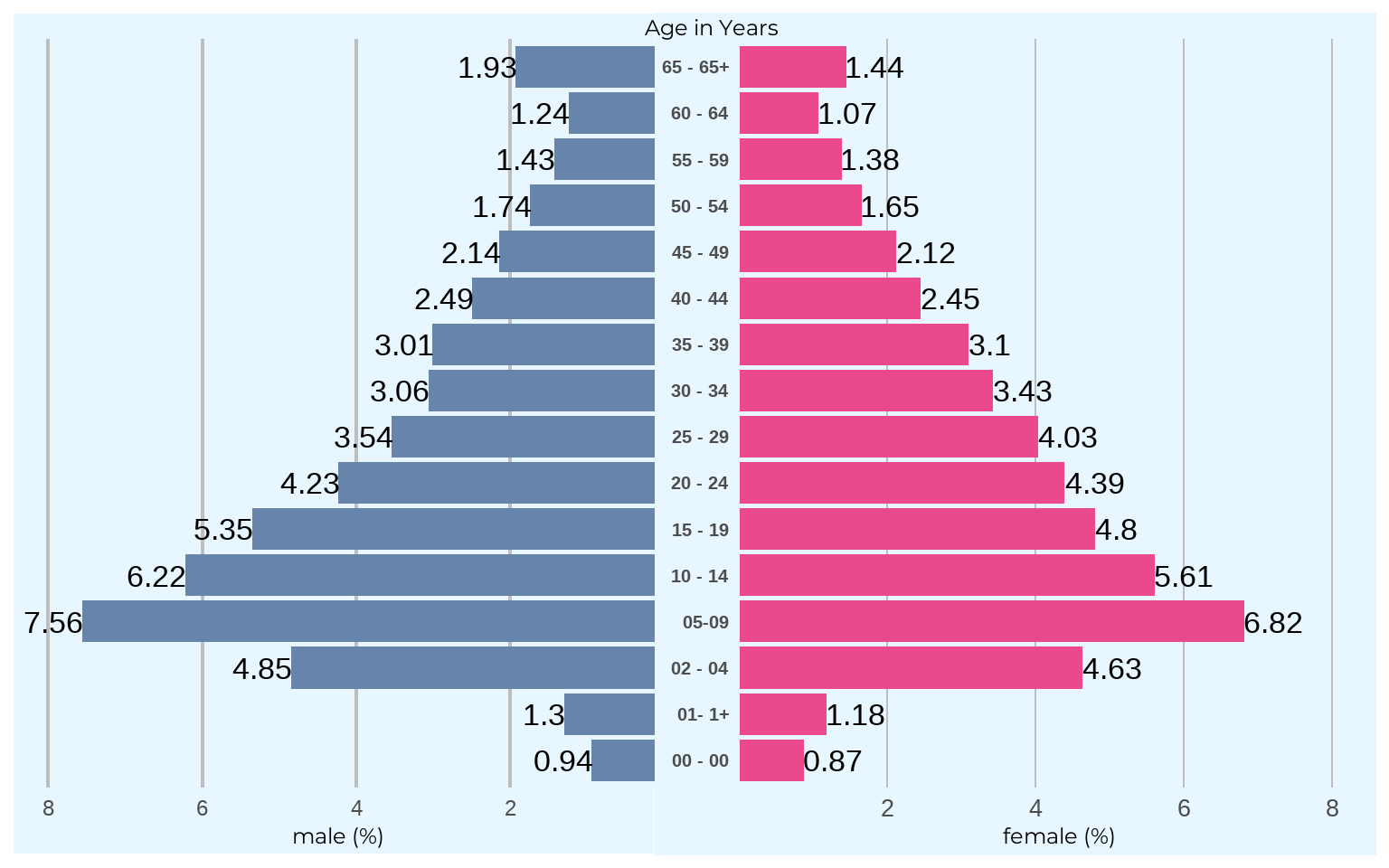
pop<-read.csv("population table.csv")
df<- pop %>%
select(Age.Groups..Years., Population, X, X.1) %>%
filter(!row_number() %in% c(1,3)) %>%
rename(age = Age.Groups..Years., male = X, fem = X.1, total = Population ) %>%
filter(!row_number() %in% c(1,2))
df$age[df$age == '0'] <- '00 - 00'
df$age[df$age == '1'] <- '01- 1+'
df$age[df$age == '65+'] <- '65 - 65+'
## female ###
fem<-ggplot(data = df, aes(x = age, y = as.numeric(fem))) +ylab("female (%)")+
geom_hline(yintercept = c(2,4,6,8), color = "gray", size = 0.5)+
geom_bar(stat = "identity", fill = "#EA498C") +
geom_text(aes(label = fem ),hjust = 0 ,size = 9)+
#geom_area()+
#theme_void()+
theme(axis.title.x = element_text(family= body_font, size= 18),
axis.text.x = element_text(size = 20),
axis.ticks = element_blank(),
axis.title.y = element_blank(),
axis.text.y = element_text(face ="bold",size= 15),
panel.grid = element_blank(),
panel.background = element_rect(fill = "#E8F6FF"),
plot.background = element_rect(fill = "#E8F6FF"),
legend.position = 'none',
plot.margin = unit(c(1,0,1,1), "mm"))+coord_flip(ylim =c(0.4, 8.2))
### male ###
male<-ggplot(data = df , aes(x =age, y = as.numeric(male))) +
geom_hline(yintercept = c(2,4,6,8), color = "gray", size = 0.8)+
geom_bar(stat = "identity", fill = "#6784AA") +
ylab("male (%)")+
geom_text(aes(label = male),hjust = 1 ,size = 9)+
theme(axis.title.x = element_text(family= body_font, size= 18),
axis.title.y = element_blank(),
axis.text.y = element_blank(),
axis.text.x = element_text(size = 18),
panel.grid = element_blank(),
axis.ticks= element_blank(),
legend.position = 'none',
panel.background = element_rect(fill = "#E8F6FF"),
plot.background = element_rect(fill = "#E8F6FF"),
panel.margin = unit(c(1,0,1,0), "mm"),
plot.margin = margin(0,0,0,0),
)+ scale_y_reverse(labels = )+ coord_flip(ylim =c(8,0.5))
g<-male + fem + plot_layout(ncol =2, widths = c(0.5, 0.5))
g_plus<- g +
labs(
subtitle = "Age in Years")+
theme(plot.subtitle = element_text(family = body_font,size = 18, margin = margin(0, 0,0,-40)),
plot.background = element_rect(fill = "#E8F6FF", colour = "#E8F6FF"),
)
g_plus